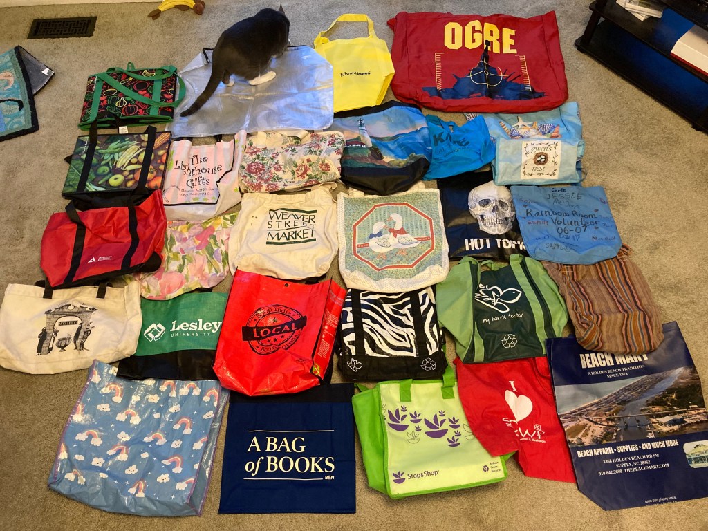
If you are anything like me, you have accumulated quite a few tote bags over the years. Some came in the mail with solicitations, or as gifts from grateful charities. Some came with purchases, often with the logo of the store on them. Some were inherited from other people, and some were gifts. A few were even deliberate purchases!
And then there are the ones you make yourself.
If you look back in the archives, you’ll find I made a couple of bags in an effort to create the perfect grocery bag–portable, washable, easy to load. I didn’t succeed, but I had fun trying, till I decided the folding box-like bags from my local supermarket were probably better than what I was coming up with. Also, I needed to accumulate some plastic grocery bags for dealing with cat litter.
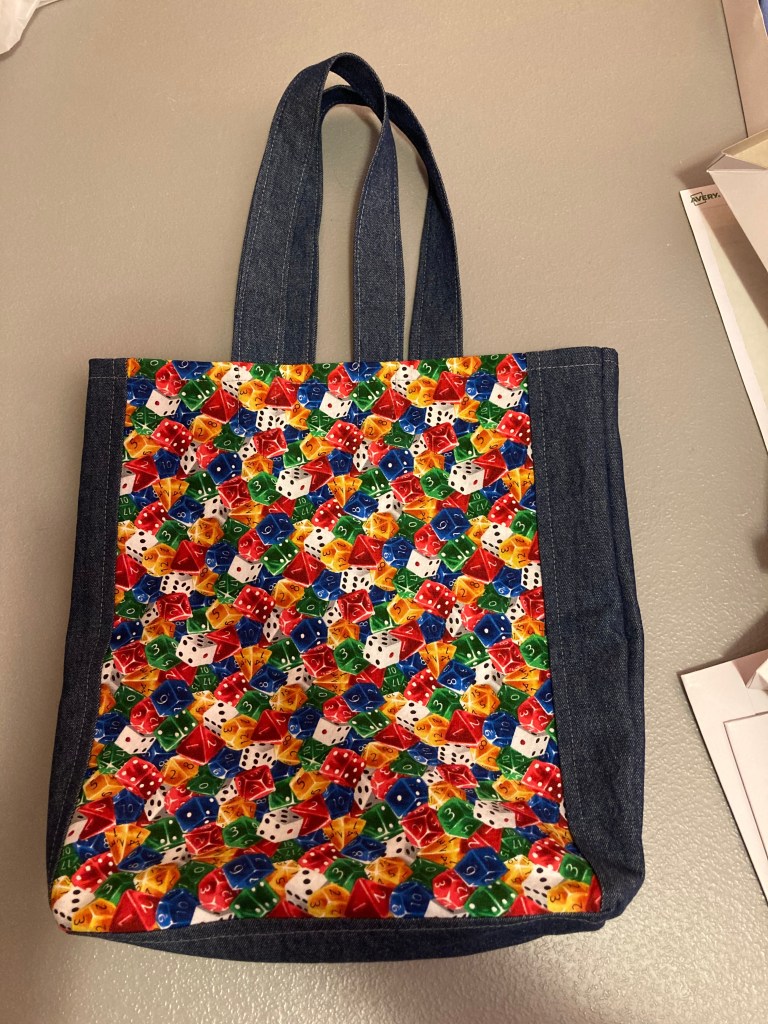
Since then, I made some mini-backpacks, but until recently, didn’t bother with tote bags. That changed when I bought some fabric with a print of polyhedral dice and wondered what I was going to make out of it. I thought about making my daughter a dice bag, to store her dice, but I figured she would already have one. A dice tray? But the point of using fun fabric is to see the print, and you wouldn’t want the confusion of a dice print when you are trying to see what you just rolled and whether your character is now in deep trouble.
I don’t remember why I decided to make her a “dice” bag–a tote bag with a dice print–but it offered a great opportunity to use a large enough piece of fabric to show off the print, and use another interesting print for lining. I also added a bit of fusible interfacing for structure. Here it is.
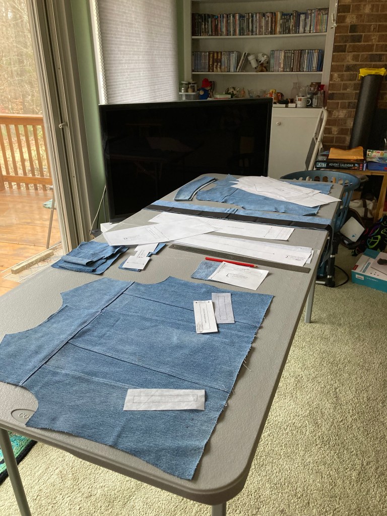
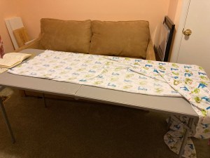
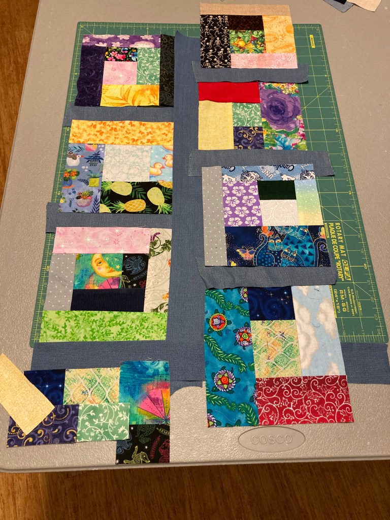
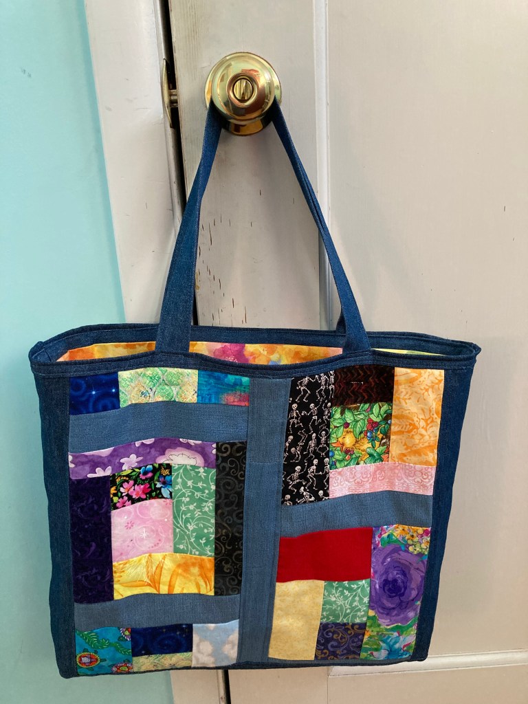
One thing leads to another, and I decided to make myself a “scrap bag”–not a bag FOR scraps, but a bag made FROM scraps. It could take the place of the bag currently holding my quilted pillow cover project. This bag would have some batting to add cushioning and shape, but since I had gotten a hand cramp working on the pillow cover, I decided I would NOT try to hand quilt the bag. A bit of machine stitching would have to do.
Originally I meant to make it more of a crazy-quilt style patchwork, but somehow ended up playing with a sort of Log Cabin arrangement.
I made a lot of mistakes as I went, most of which I documented in my new (ish) sewing log. For one, since I didn’t plan to hand-quilt, I used a piece of old sheet as backing. In retrospect, I should have used something lighter. Better yet, I should have used the lining as the backing and done a very little, not so tiny, hand stitching to hold it together. Or so I decided as I tried to machine-quilt a few lines and remembered that I am no good at it.
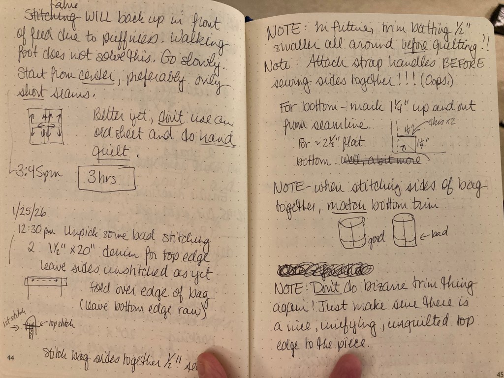
There were some other problems–how best to attach the handles, where exactly to stitch across the bottom corners to create a boxy bottom to the bag, and whether I ought to have some kind of trim along the top. (Yes, I should, but maybe not applied that way.)
All in all, though, I really like the bag. I used some colorful fabric that I love for the lining, having recently watched part of Youtube video by Bernadette Banner in which she admonishes her audience to USE YOUR GOOD FABRIC rather than saving it indefinitely for that perfect project that never comes along. After all, there is so much lovely fabric out there, you will surely discover yet more fabrics that speak to you, and you may not appreciate this particular one as much years from now as you do now.
As I think I’ve said before, I really like to make use of bits and pieces. Some people like to start with an idea and then look for the materials (and sometimes I do too,) while other people enjoy starting with the materials and looking for a project. Bags seem to be a good way to turn odd bits of fabric into something useful. Who knows, maybe I’ll make yet another tote bag this year. I’ve got plenty of fabric.
Till next post.
P.S. After seeing how many totes we have, we are getting rid of about eight of them.