Here are some more reflections, shadows, and combinations of the two. Mostly, these are photos of interesting light effects that I happened upon in my everyday life. I think it’s worth taking a moment to notice the interesting results of light in the world.
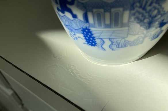
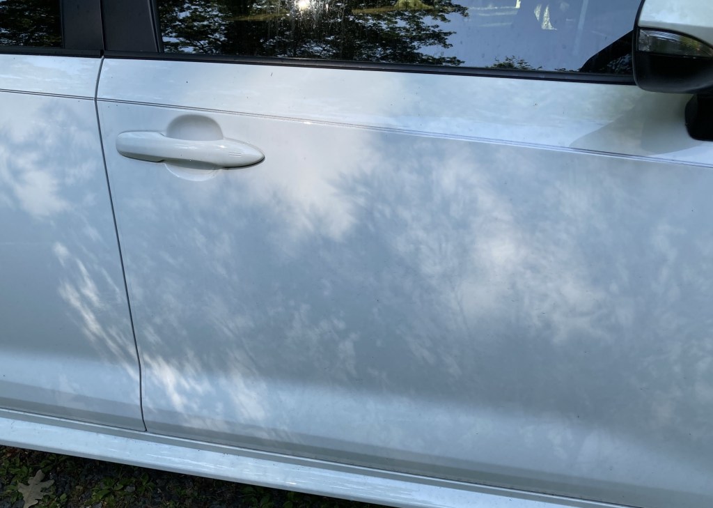
Shadow on my car AND a reflection on my car (look above the shadow)My reflection as seen through pine pollen (thank you, North Carolina!) Intriguing reflection–look very closely at the light hitting the countertop
Well, that’s all for this post. But you can check out my previous posts on this subject:
I guess it isn’t fair to call shadows a “trick” of the light. Perhaps it would be more accurate to describe them as creating shapes and colors on surfaces where those shapes and colors wouldn’t normally appear. Here I pair them with photos showing the difference that shadow and contrast can make to colors.
First, the shadows. I already have one post just on shadows, so you know I love the effect they can create, like a temporary mural with movement. Here are two more images that caught my eye.
A hanging plant casts a partial shadow above another plant.The delicate shadows of a Japanese maple.
Now for the color trick. I was lying on the floor stretching my leg when I noticed that where the green living room paint touched the yellow paint of the kitchen, something strange happened.
Where’d this blue stripe come from?The painted edge is definitely the same green paint.It’s a trick of the light!
A while back, I read the book Joyful by Ingrid Fetell Lee, after having seen her TED talk. One of several things that struck me was something she said about joy being something that showed up in moments, like the delight on seeing an unexpected pop of color in a sea of blandness, or on suddenly hearing a cheerfully familiar tune, or being entranced by a really interesting painting. And further, that these moments significantly enrich our lives, which I really think they do.
And so it seems worth while to notice the interesting shadows around me, or the strange ways of color in light and shadow. Honestly, it’s probably better when you see these things pop up in your own life, rather than read about it in someone else’s blog. Photos just don’t capture it.
So really, the point of this post is probably “Take a second look at the things around you. Isn’t that an interesting shadow? Are there any color tricks around you now?”
One last thing, which I just noticed in the first photo and which may be due to the camera rather than a trick of the light at the time. Since when is my window frame pink? It’s white, contrasting nicely to the pale aqua wall in a paint called “Sparkle.”
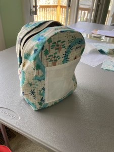
It’s my third post about mini-backpacks (though maybe my fifth actual bag)! that I made in imitation of my favorite purse. One of the difficulties is adding enough stiffness so the bag doesn’t turn into a limp pool of fabric that is hard to open and manipulate.
This is what happens without enough stiffness.
Since my current bag is showing wear at the bottom corners (a design flaw–I shouldn’t have had corners there), I decided to make a new bag. I used some material from an old pair of pants, plus scraps of interesting prints, and lined it with a jungle map print. And this time, I quilted the exterior of the bag.
I didn’t do a fancy design, or fancy quilting. I wanted to see if quilting the bag gave it enough stiffness that it wouldn’t need piping on the edges or some other sort of structural support. It did! It also feels pleasantly soft to hold.
Another change was an exterior pocket with a zipper, something none of my previous mini-backpacks had. I like the pocket very much. However, I think I should use a different procedure for it next time. It would also be nice if the zipper pull for the pocket was on the left, matching the main zipper. Oops.
I experimented with the interior as well, and learned a few other lessons. First, while I like the fun map-print, I discovered that a busy print makes it harder to find items in the bag. In the future, I intend to use more subtle prints for lining my bags.
Second, I added an extra-large pocket on one side, gathering the top with elastic. I thought it might serve as a sort of divider in the purse, but I forgot to interface the lining of the bag, let alone the pockets, and the interior came out soft and formless. When the bag is turned right-side out, the pocket gapes even more than it appears in this picture of the bag inside-out.
The bag inside out, showing the fun lining and large pocket.
I used white fabric for the smaller phone pocket, which does make it easier to locate. White on off-white wasn’t the best choice, but I was in a hurry. I will remember in the future that yes, I should always make the phone pocket stand out slightly from the rest of the lining, whether by using a different color or perhaps by trimming the upper edge with something colorful.
Still inside out, but showing the other pocket.
I’m delighted with my bag, despite its shortcomings. However, I really need to write up my pattern notes before I forget what I learned.