Who Designs This Stuff?–the impressive origami of modern packaging

Like many people, we purchase way too many things that come packaged in one sort of cardboard box or another. Boxes pile up and have to be recycled, since we only have need for a few to use for this and that. As a result, every so often I spend time breaking down cardboard boxes so I can fit them neatly into the trunk of my car… and sometimes I am surprised at the ingenuity of the packaging.

Most of the standard shipping boxes are held together with tape, but boxes that were designed to hold a specific product–something electronic, perhaps–are often folded into shape and can be unfolded and flattened without cutting any tape at all. (Like a pizza box.) Not only that, but sometimes the inserts are also just cleverly folded cardboard, designed to hold a particular shape of product securely during shipping.

Who comes up with this stuff? How do they do it? I imagine the packaging engineers must have a whole repertoire of standard folded box templates. Then, when assigned to make a package for some assortments of product and parts, they tweak them. Surely there’s a computer program involved, too. (Maybe it measures how much cardboard different potential packaging solutions would require.)

But really I don’t know anything about how they do it. I just know that a lot of ingenuity apparently went into these pieces of cardboard that I am about to recycle, and so, in appreciation, I took a few photos recently to offer as samples.

I think this one had a lid with tabs.
Box with fold-over lid with tabs.
See the attached insert on this box. I’m not sure what it held.

I wish I had taken photos of some of the more elaborate folded inserts I’ve seen, and also photos of the “before” stage–when they were still boxes and compartments and oddly shaped cradles for cables.

Till next post.

Too Big, Too Small, Just Right?–trying to sew a copy of my favorite fleece hat

I like hats.

In the summer, I usually choose a woven straw gardening hat. I like the fact that the weave doesn’t completely block my upward vision. I prefer a hat with a smallish brim–large enough to partially shade my face (and especially my nose), but not so large that it gets in the way.

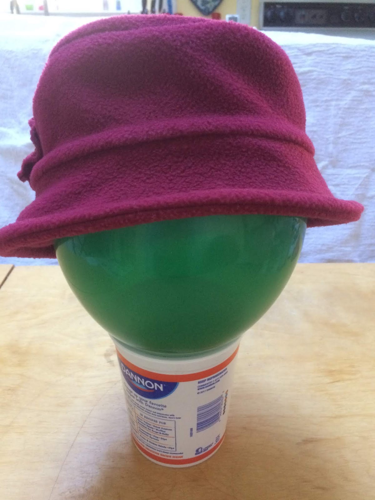
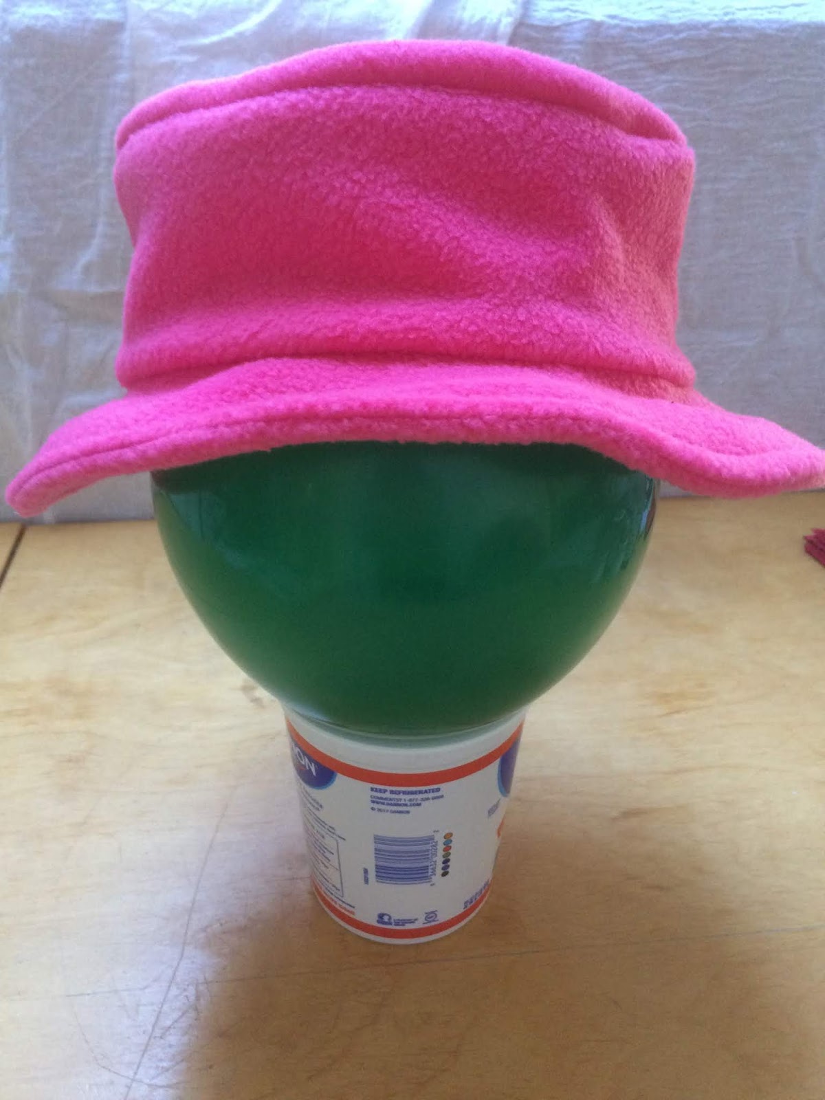
In winter, I want a warm hat. I used to walk outside more in winter, so my favorite hat was the kind that is woolly or fleecy with earflaps. It looked all right and it kept my ears warm. But several years ago I found a fleece hat with a brim that I really liked, and I have been wearing that instead except when the weather is very cold.

Maroon fleece hat with upturned brim.
My favorite winter hat.

It has a matching fleece “flower” and can be worn with the brim tilted up or down. With the brim down, it rather resembles a cloche.

Maroon fleece hat with downturned brim
My favorite winter hat, cloche style.

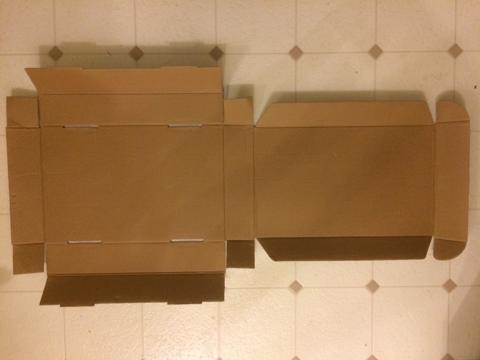
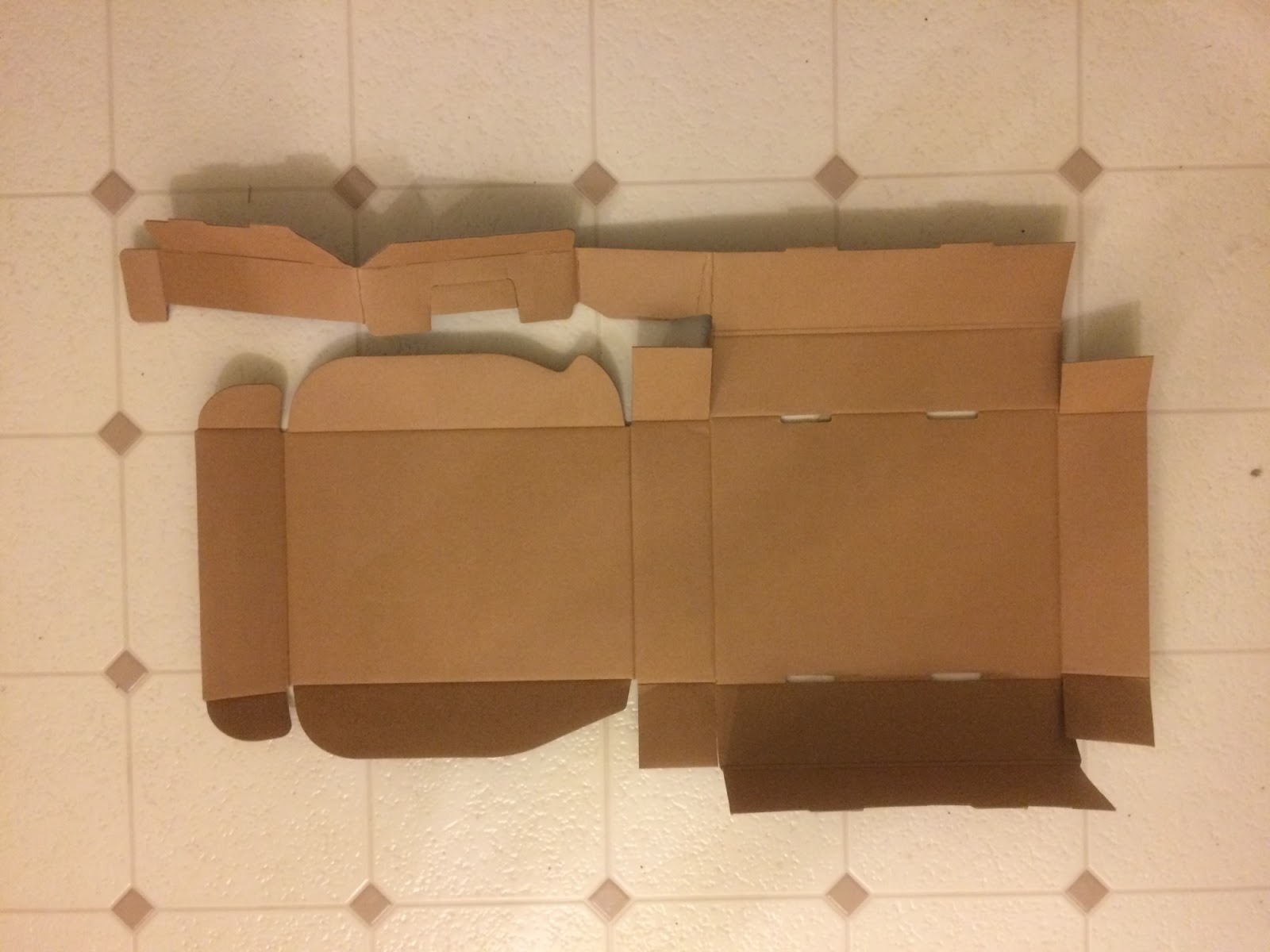
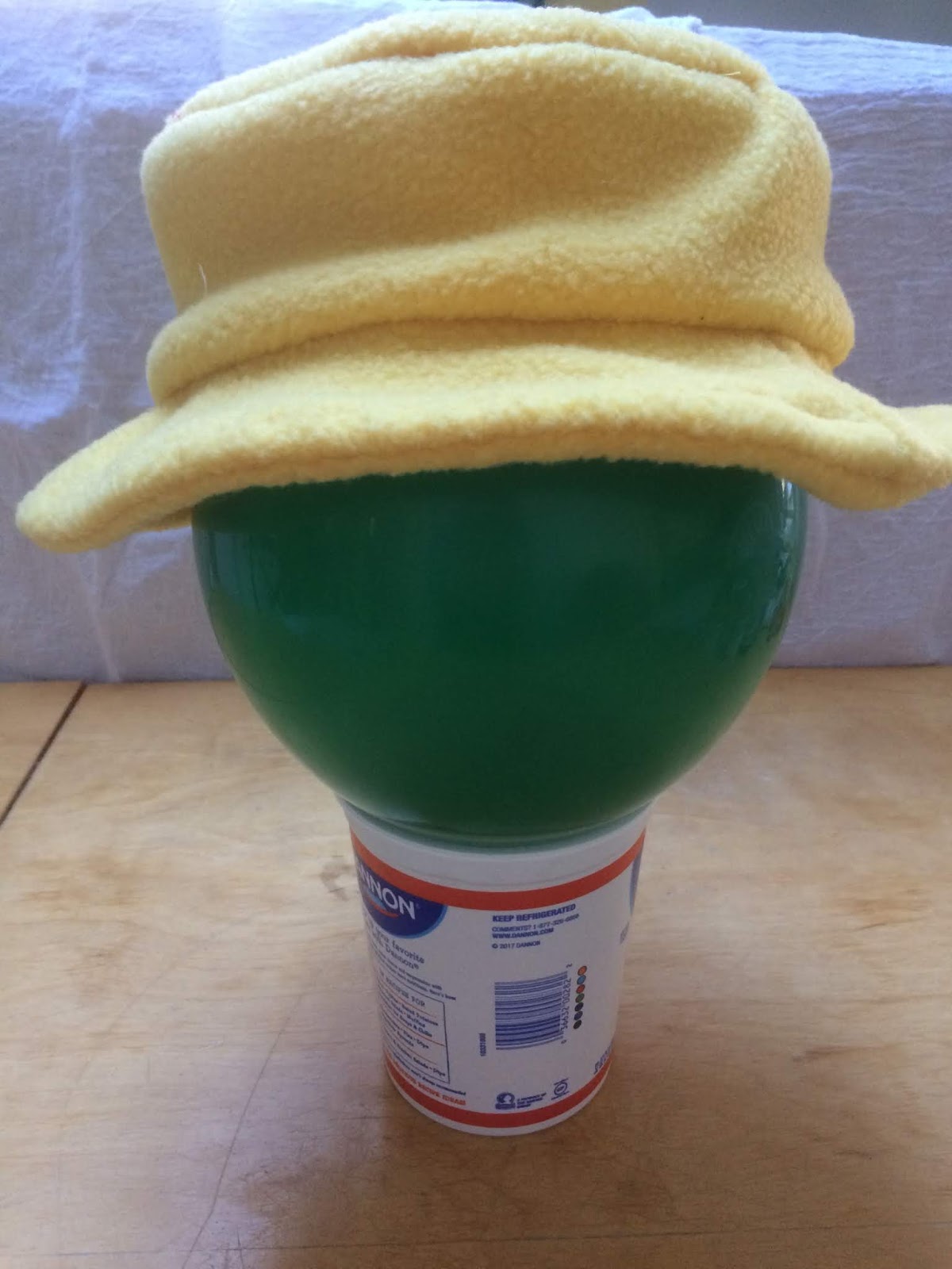
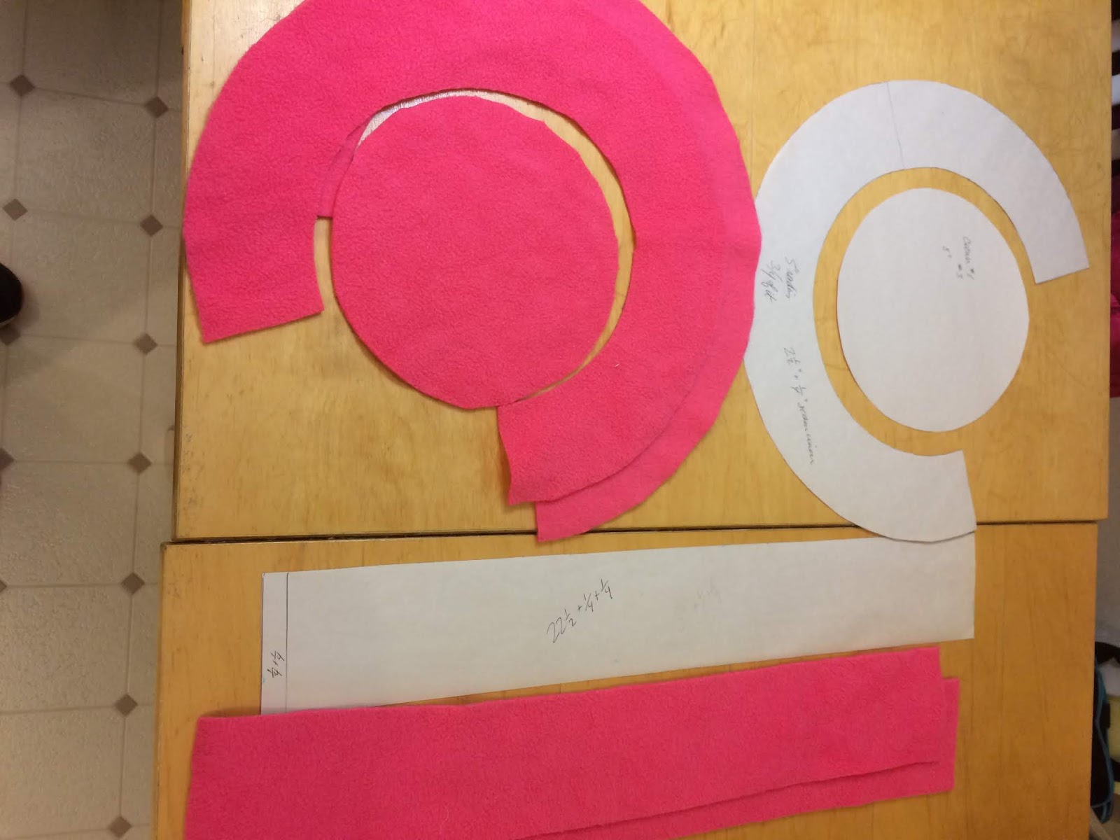
I thought I would try to duplicate the hat in different colors of fleece. It is composed of two layers for the brim, two layers for the sides, and one layer for the top. I measured it carefully and found some yellow fleece left over from a previous project. As I tried to work out the size of the brim, it occurred to me that perhaps the makers of the hat tried to save on fabric by cutting one of the brim pieces right around the circular top piece. I decided to try making the curve of the brim not much different from the top. I didn’t have the sewing machine out right then, so I mostly basted it together by hand. After all, I didn’t know if it would actually fit.

Yellow fleece hat with brim that is mostly horizontal.
Too big.

It wasn’t quite what I was after. Clearly 1/2″ seam allowance was much too bulky, and I didn’t want the brim to be quite so horizontal after all. But it wasn’t bad. So I took my careful measurements, did a lot of calculations to figure out how I could get an interior curve of so many inches and an exterior curve of so many other inches. Solving equations with two variables came into play.

Not content with changing one part of the pattern (and the seam allowances), I tried to make the top a bit smaller in the hope of making it look rounder. I also tried using black satin as the inner side piece, with the thought that it would slide on and off nicely.

Yellow and black fleece hat with downturned brim.
Too small.
Yellow and black fleece hat with upturned brim.
Maybe better this worn this way, but still too small.

Nope. The crown looked (and felt!) noticeably too small, and the brim was almost vertical. There is a nice style of hat with such a turned-up brim, but it wasn’t the style I was after.

Also, I discovered that the second layer of fleece on the sides helps give the hat structure. If I ever use a thinner fabric for the inside, I should add some interfacing to give it a bit more stiffness.

So eventually, some weeks later, I decided to try again. The first hat was too big (and horizontal) and the second was too small (and vertical). Surely something in between would be just right!

I drew a different curve for the brim somewhere in between the first two and used the larger pieces for sides and top.

Pattern pieces for hat and pieces cut from pink fleece.
The pieces of the pattern.
Pink fleece hat with mostly horizontal brim.
The third try.

Was it just right?

Nope.

The brim was still much too horizontal, and, in part because of the narrower seam allowances, the sides were way too tall and the top too large.

What are the take-home messages here? First, it is hard to accurately measure a fleece hat. Second, seemingly small changes can have significant effects… and yet, other changes make surprisingly less difference than one might expect. (Fleece is very stretchy.) Third, a walking foot is a fantastic thing to have when sewing fleece by machine.

I have quite a lot of lime green fleece that my daughter was going to use for a project years ago. After I’ve had time to recover from my pink-hat disappointment, there will likely be a hat #4 in lime green. Who knows, maybe that one will be Just Right.

Till next post.

Interlacing, Transforming, and Curious Perspectives–wonderful tricks in art


I was trying the Zentangle ® step-out (step-by-step instructions for drawing a pattern) for the tangle “F2F” or “Fringe to Fringe”, and it occurred to me that someone who creates one tangle that appeals to me may have created others. So I tried looking up Tomas Padros to see what other tangles he might have created.  (Apologies for failing to get the accents over the first “a” and second “o” in his name.)

 
I found his instagram page, with all sorts of fascinating drawings on it. This brought to mind M. C. Escher and some of the things I like about his drawings: things that go under and over each other, transformation from one repeated shape to a different one, and curious perspectives.
 
What is it about these features that is so appealing? 


The appeal of curious perspectives is perhaps the easiest to explain. Escher has his impossible waterfalls, his stairs that seem to defy gravity, which trigger a sense of “what the heck?” and an urge to look more closely. I’m not sure if Tomas Padros has any impossible drawings, but some of his designs give me a similar sensation of fascinated bewilderment.


The appeal of transformation seems the next easiest to explain. Escher is famous for art in which fish transform into birds, or dark birds in daytime become white birds at night. In other Escher works, simple repeated shapes gradually become detailed drawings of animals.
 
 
I think the fun is in seeing first the contrast between the two extremes, and then following, step by step, the changes that lead inexorably from one to the other. In Padros’ case, he combines and contrasts related tangles, and variations on them, in ways that suggest transformation.
 
 
Finally, what is it about patterns that interlace, entwine, and basically go over and under themselves? I love basket-weave patterns, Celtic knots, and the Hollibaugh tangle. Why?
 
 
It’s hard to say. These over-and-under patterns create an interesting sense of depth, for one. And perhaps by “hiding” parts of the design (those parts don’t actually exist, but it feels as though they do, somewhere out of sight) it appeals to the part of me that likes secrets and hidden connections between things. Clearly Padros likes patterns that interlace, too. And while I don’t think there is as much emphasis on interlacing and overlapping in Escher, there is certainly some.
 
 
In summary, it’s amazing what effects can be created with pen and paper (or printmaking.) Amazing and wonderful.
 
 
Till next post.