Sidebars, Summaries, Speech Bubbles, Oh My! –text and graphics in recent children's nonfiction

There has been a trend in the design of children’s nonfiction which is not merely heavy on graphics, but which mixes text in with graphics, adds snippets of text elsewhere on the page (sidebars, marginal notes, speech bubbles), and uses a lot of variation in the typeface, color, size, and even the angle of the text (e.g. diagonal). All of this makes the text increasingly difficult to read, especially out loud.
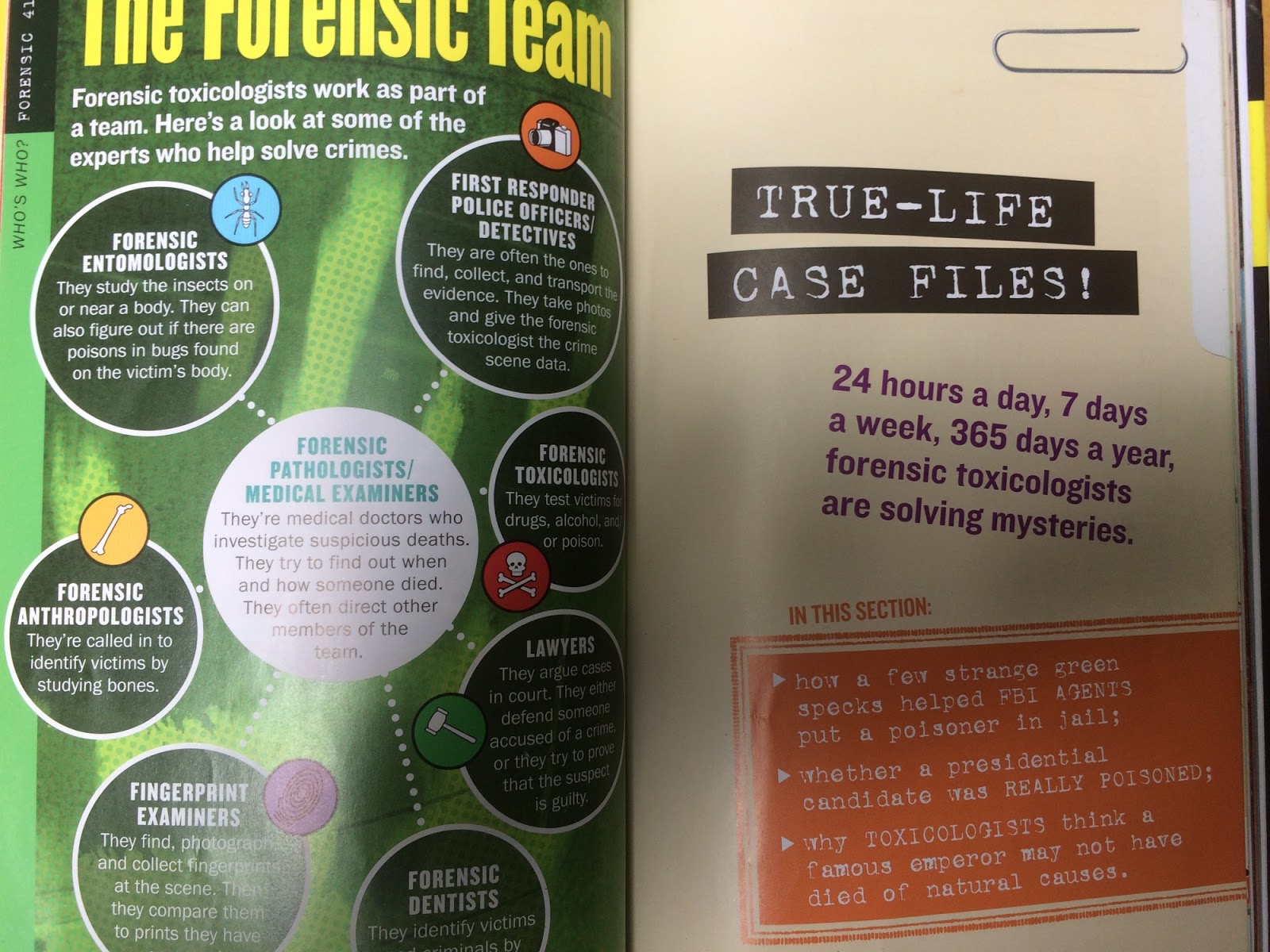
Note the variation in text and even the varied angles.
The first problem is the appearance of the text itself. It is visually distracting, though sometimes attractive. I especially hate it when words in a sentence vary in size, or when they use “bounce” lettering and the letters within words go up and down. (This is probably more common in fiction, actually.) I understand that sometimes there is a sufficiently good reason for this visual effect, especially in poetry, but it always makes it harder to read.
The second problem with all these bits of text is deciding where to start reading. Occasionally there is so much extra text that the main text is hard to find. Let’s assume you’ve found the main text and started reading. The problem with all the sidebars, marginal notes, and speech bubbles is that when you reach the end of the main text on a page spread, you are faced with a decision. Do you turn the page and continue reading the main text, or pause to read aloud the extras? This is especially awkward if the main text ends mid-sentence. But if you skip the extras and come back to them later, you find yourself going back through the book again and reading, in isolation, bits that were meant to go along with earlier parts of the text—an explanation of mummification, say, that was on a page that talked about tombs and the discovery of mummies.
Finally, I’ve noticed repetition of content among the different bits of text. This isn’t a problem with sidebars, which go into detail on some topic touched on in the main text, but often marginal notes and subheadings repeat information that is in the main text. In particular, I’ve noticed some children’s nonfiction (as well as some magazines for adults)  put summaries at the top of sections, just below the heading. Why? If I’m going to read the section, I’ll find out for myself what it’s about. I’d rather not to have the discovery spoiled by being told in advance. If the summary is meant to take the place of reading the text… why write the book at all? And if it’s meant to sum things up after you’ve read the section, why put it at the beginning?
Sidebar and summaries-well, sort of.
I will say that there is one style of book where all this extra text really isn’t a problem. Books divided into topics that each take up a single two-page spread don’t force a choice between turning the page and reading all the extra bits. DK has a lot of very pretty photo books like this. Of course, this also means the book can’t get into much depth on any particular topic or have much of a narrative, but for some purposes that’s just fine.
A pretty photo book.
So why has this design style caught on? Perhaps the increased use of sidebars imitates the use of hyperlinks in on-line articles. But are sidebars/hyperlinks even necessary? Part of a writer’s task is to decide what information to include and in what order to present it. Facts in the world exist in an interrelated mess. The writer has to present his or her selection of facts in a linear way, highlighting some of the relationships among them while leaving out others. It’s the only way to make the result readable. The writer always wants to include more information than can be coherently presented.
Perhaps that’s part of the problem. By putting some of the information in sidebars/hyperlinks, the writer can avoid some tough choices. The problem is that hyperlinks are fairly unobtrusive (underlined blue text, say) while sidebars are not.There doesn’t seem to be any cost to including hyperlinks since they can be easily ignored while reading—and there are no page turns in a blog post or internet article. Sidebars, on the other hand, do compete for attention with the main text. I don’t mean that they aren’t sometimes worthwhile, just that there is a trade-off that must be considered.
What about the other extra bits of text? I suppose they are meant to look energetic and exciting–as though books would be dry blocks of words without the color and dramatic angles they provide. It also suggests to my mind that publishers expect their young readers to have the attention spans of a gnat. I hope they are underestimating their readers. I also wonder if by designing books in this way, they might unwittingly be contributing to the problem.
For myself, I mostly find the busy-ness off-putting. What about you?
Till next post.

Note: The pages in the photos are from Killer Wallpaper: True Cases of Deadly Poisonings by Anna Prokos, and from Mesopotamia, a DK Eyewitness book. They’re both good books.

"The Poisoner's Handbook" and Reading About Real Evil

Recently I read The Poisoner’s Handbook: Murder and the Birth of Forensic Medicine in Jazz Age New York, by Deborah Blum. I was originally looking for information on poisons for a possible new mystery novel, but got caught up in the stories of poisonings, both accidental and deliberate, and the development of techniques for detecting them—not to mention the story of Prohibition in New York, and the politics that was inevitably involved along the way.
It was a very good book, but there was nonetheless something sort of creepy about reading an interesting story about a poisoning and remembering, suddenly, this really happened. Mary Frances Creighton really did kill first her brother, then a friend, with arsenic. A group of three people really did take out insurance on an old drunk, and then kill him with carbon monoxide after several attempts to kill him in other ways failed. Some people—too many—really are capable of doing evil things.
This brought to mind an incident from years ago, in college. Our class had been assigned a reading on pornography by someone whose name I have now forgotten. She described in impassioned terms some incredibly degrading images and corresponding attitudes toward women. Seriously, to say that these people were treating women as objects fails to recognize how much more carefully and gently we treat most of our inanimate possessions. It was extreme.
A number of us were sitting on the steps outside, waiting for class. One young woman started talking about the article, basically saying that it had seemed kind of over-the-top to her. “Who really thinks like that? None of the men I know,” she said.
An older student in the class, a soft-spoken man in his late twenties or thirties, heard her. “I’ve known men like that,” he told her. “They’re out there. Believe me.” I think everyone went quiet for a while after that.
So now I’m thinking maybe I should read about people who do horrible things, if only to remind myself that some people are capable of knowingly and willingly inflicting terrible suffering on others.  I do read about terrible things in the newspaper, but there’s a difference between reading about, say, dictators, who deal in evil on a scale that’s hard to comprehend (and often dealt out through intermediaries), and reading about quite ordinary individuals carrying out quite specific and describable crimes.
I’ve been lucky enough not to have had to deal with anyone really evil. Even people who are merely very unpleasant have generally been on the fringes of my life, not a daily part of it. As a result, perhaps, I tend to look for a charitable explanation for people’s actions.  
Often this is a good thing. But as the cases in The Poisoner’s Handbook show, sometimes there’s no room to wonder whether a person’s intentions were misunderstood or their actions excusable. Killing someone for insurance money makes one’s attitude toward other people quite clear. Sometimes, people really are just that bad.
It’s something to keep in mind.
Till next post.

Nancy Drew Computer Games and Mysterious Boxes

My daughter and I used to really enjoy playing Nancy Drew computer games together. We’d take turns at the mouse, clicking on objects and puzzles, moving around, and having conversations with the characters we met. An important part of playing these games is investigating anything that can be opened—doors, drawers, and boxes of all kinds.
Often these boxes require you to solve a puzzle in order to open them. In a computer game, the puzzle could be anything from sliding pieces to rotating colors in a specific order to… well, any kind of game you can play on a computer. In the real world, the puzzles are a bit more limited. Still, I love boxes that have a trick to them.
All boxes are a bit mysterious in that you can’t see what’s inside until you open them. (Okay, glass boxes are an exception.) Back when I was young, a neighbor who collected decorative boxes told me that a box should always have something in it, even if it is just a penny. I think she had it right.
assorted decorative boxes, some enameled, some inlaid, one painted ceramic
So even boxes that are neither practical nor tricky have two chances to delight you. They can be beautiful on the outside, and they can hold something interesting on the inside. For that matter, they can be decorated on the inside, which is a lot like holding something interesting.
One opened inlaid box displaying coins, one open enamel box displaying painted butterfly on the bottom
Puzzle boxes offer a third delight—that of solving the puzzle. Even if you already know how a particular box is opened, there is something pleasantly sneaky in the knowledge that other people will not be able to open it without some difficulty.
 I have two puzzle boxes. One, which I received from a friend, is only mildly tricky. The pieces of the fish have to be removed in a specific order, and some slide up while others slide sideways. Still, I love the fact that it is not a straightforward box.
The other box is a Japanese puzzle box. Opening this box involves sliding whole surfaces forward or back or up or down, in the right sequence. I believe it is one of the easier ones, and that is difficult enough for me.
A fish-shaped puzzle box and an elaborately inlaid Japanese puzzle box
Photo shows a fish puzzle box partially opened.
Finding a place to display decorative boxes is a problem, though, especially if you end up with lots of little ones. What to do? Well, when I went looking for my small decorative boxes so I could take photos of them, I looked in… yep, more boxes.  One of those was a decorative box of the sort found at Michael’s.
And speaking of mysteries and discoveries—in the same box I found the record of my smallpox vaccination, dated 1977.
Photo includes cover of international vaccinations certificate from the 1970s.
You never know what you’ll find.
Till next post.